
Home Office Paint Colors That Go With Your Desk
Choosing a wall color for the room you work in? Your desk is already part of the picture, so start by seeing each color behind a real desktop finish.
Some links here earn me a commission if you buy, and it doesn’t change your price. How this works
UPLIFT Desk sent me a V3 Standing Desk, a drafting chair and accessories to review. My opinion is my own.
The short answer
Paint a home office a soft green or blue, and check it against your desk’s finish before you buy a sample. I’d pick Sherwin-Williams Celery, because it’s a light green that brightens a room.
Free tool
The color matcher
Pick a wall color, a desk and a finish, and see them together.
Lighter walls
Deeper walls
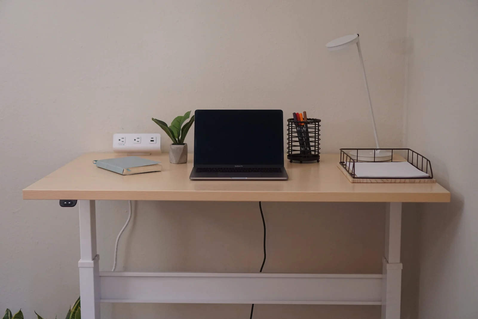
Every finish is shown on my own desk’s top, even the ones from UPLIFT Desk and FlexiSpot.
Our den corner on November 16, 2020.
The desk finishes in the color matcher are cut from UPLIFT Desk’s and FlexiSpot’s swatch photos and the RightAngle finish chart on NextGen Furniture’s site. The paint colors are the values each paint brand publishes. The matcher’s room is a photo of our den, and whatever you pick shows in that photo’s own light and shadow.
The desk in the photo is my own, a RightAngle Bonita ET, and it’s been in that corner since 2020. In real life, its top is a light maple and the wall behind it is white.
I’d paint that wall Celery, since I’d rather the desk blend in than stand out. You might want the opposite, so here’s which walls do that for each kind of desktop.
The walls that make your desktop stand out
- White top: Webster Green, Country Tweed, Cushing Green or anything darker
- Light wood top: Grizzle Gray, Grounded, Oceanside or Tarpley Brown
- Mid wood or bamboo top: Grounded, Oceanside or Tarpley Brown
- Walnut or dark wood top: all 11 of the matcher’s lighter walls, Celery, White Heron and Gray Owl among them
- Black top: all 11 lighter walls, plus Letter Gray and Country Tweed
Worked out on UPLIFT Desk, FlexiSpot and Bonita tops. FlexiSpot’s Maple laminate is darker than UPLIFT Desk’s, so it counts as mid wood.
Which color should you pick for your desk and your room?
Start with your desktop, since it’s already there, then let the room’s light settle it.
A white or light wood desk
To let it blend in, stay light, with Celery or White Heron. Grounded and Oceanside go the other way, and both make a white, maple or bamboo top stand out.
Bonita ET reviewThe desk in my den corner, six years on
A walnut or other dark wood desk
Behind the UPLIFT V3 Standing Desk in Walnut Laminate or the FlexiSpot E7 in Black Walnut, Celery and Gray Owl both make the top stand out. For a desk that blends in instead, a deep green like Webster Green or Cushing Green does it.
A dim room, or a sunny one
For a dim or north-facing room, pick Celery, which is light and has a warm undertone. Webster Green and Grounded belong in a sunny, south-facing room, where a deep color gets the light it needs.
Work NookHow to set up a desk in a corner of any room
Will your desk stand out against the wall, or blend in?
Whether a desk stands out comes down to how far apart the wall and the desktop are in lightness. The bigger the difference, the more your desk shows.
A white desk in front of White Heron, the lightest color in the matcher, all but vanishes. Put the same desk in front of Tarpley Brown, and it jumps right out.
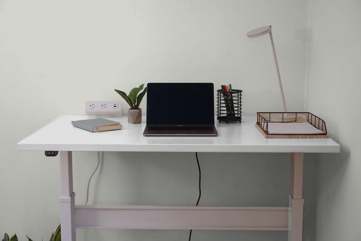
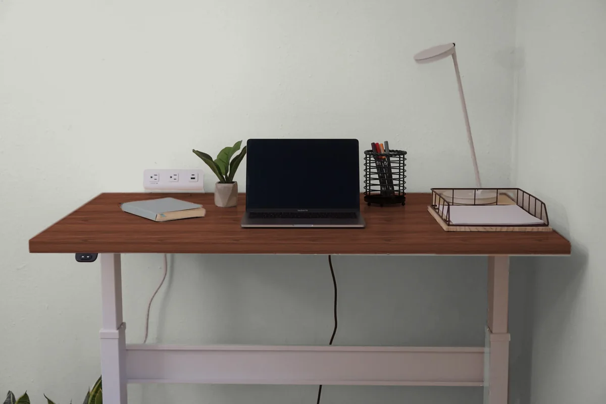
Legs count too. A white frame melts into a white wall, and a black one stands out against every lighter color.
Neither look is wrong. If you love your desk, give it a wall it can stand out against, and if you’d rather the corner fade into the room, let it blend.
The easy mistake is choosing the wall from a chip on its own, then finding the desk does the opposite of what you wanted. A deep green looks great on the chip, and then a walnut top sinks right into it.
The matcher shows you which way your desk will go before you open a can. That’s a lot better than finding out after the painting’s done.
How does your room’s light change a paint color?
Your wall changes color over the workday. In the morning it picks up a warm, yellowish glow, midday sun can wash it out and cool it down, and by late afternoon it’s taking on a reddish cast.
Which way your windows face matters most. If yours face north, you get the least light all day, and it’s cool light, so a color with a cool undertone can make the room look colder. In a room like that, go for a light color with a warm undertone, like Celery.
If your windows face south, you get warm light most of the day, and most colors work, as long as you skip anything too warm. East and west rooms swing between warm and cool light, so choose for the hours you’re actually at your desk.
Barely any daylight? Pick something light, like White Heron or Gray Owl, since a pale wall reflects more of whatever light comes in.
Then look up at your bulbs. Warm, yellow ones bring out warm colors and mute cool ones, and cool fluorescent light lifts blues and greens.
So when are you in there most, first thing in the morning or late in the day?
Warm or cool: does the undertone matter?
An undertone is the hint of warm or cool under a paint’s main color. Warm ones have a red, orange or yellow base, and cool ones have a blue, green or true gray base.
Undertone matters most next to wood. Wood stains run warm or cool too, and the usual advice for floors is to match the undertones, a warm wall with a warm floor and a cool wall with a cool one.
Celery and Alpaca lean warm, while Rock Candy, Oceanside, White Heron and Gray Owl are cool.
A wood desktop has an undertone as well, so the quickest check is a chip held right against it.
Which white goes with it, and what about the floor?
Your wall color will sit next to trim, a baseboard and probably a floor you aren’t changing.
Behr’s office palettes put whites like Natural White, Whipped Cream and Winter White on the trim and doors. For wall partners rather than trim, Benjamin Moore pairs Glacier White and Elmira White with Webster Green, and Sherwin-Williams pairs the warm neutral Cocoon with Celery.
With a wood desk and black or brass accents, the white to try is Behr’s Swiss Coffee, a warm one. None of these is among the 19 in the matcher, so they’re ones to sample on their own.
Floors make it simpler. Over a dark floor, light walls are the classic look, since the floor anchors the room and the walls keep it bright.
That’s the safe bet in a small or dim room, too. Crisp white baseboards make a clean break between the two.
Which paint finish should an office wall get?
Matte or eggshell. Benjamin Moore names them the most popular sheens for office walls, and matte cuts down on glare.
Save the shinier finishes for cabinets, doors and trim, whether that’s satin, pearl, semi-gloss or gloss. And for a bookcase or a desk painted to contrast with the wall, go all the way to high gloss.
Behr makes a scuff-resistant paint for office walls, called Ultra Scuff Defense. If your chair tends to meet the wall, it’s worth a look.
Which colors help you focus?
The right color for focus depends on the work you do at your desk. For detail work like spreadsheets, edits and anything you check twice, the usual advice is a soft blue or green. Creative work can take a livelier color.
Of the 19 colors in the matcher, the soft greens and blues are Celery, Whitewater Bay, Half Sea Fog and Beneath the Clouds. For something deeper, Country Tweed and Oceanside are two of Sherwin-Williams’ soothing office picks.
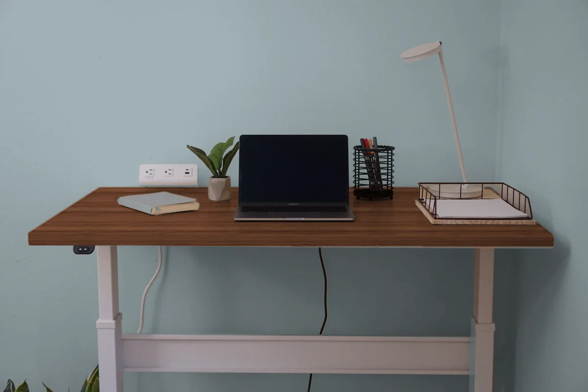
Whatever you pick, it’s the wall you’ll look at past your monitor all day.
What are the 2027 colors, and what’s replacing gray?
For 2027, all three brands went green. Sherwin-Williams picked Celery, Benjamin Moore picked Webster Green, and Behr picked Grounded, a mossy olive.
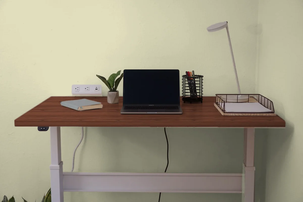
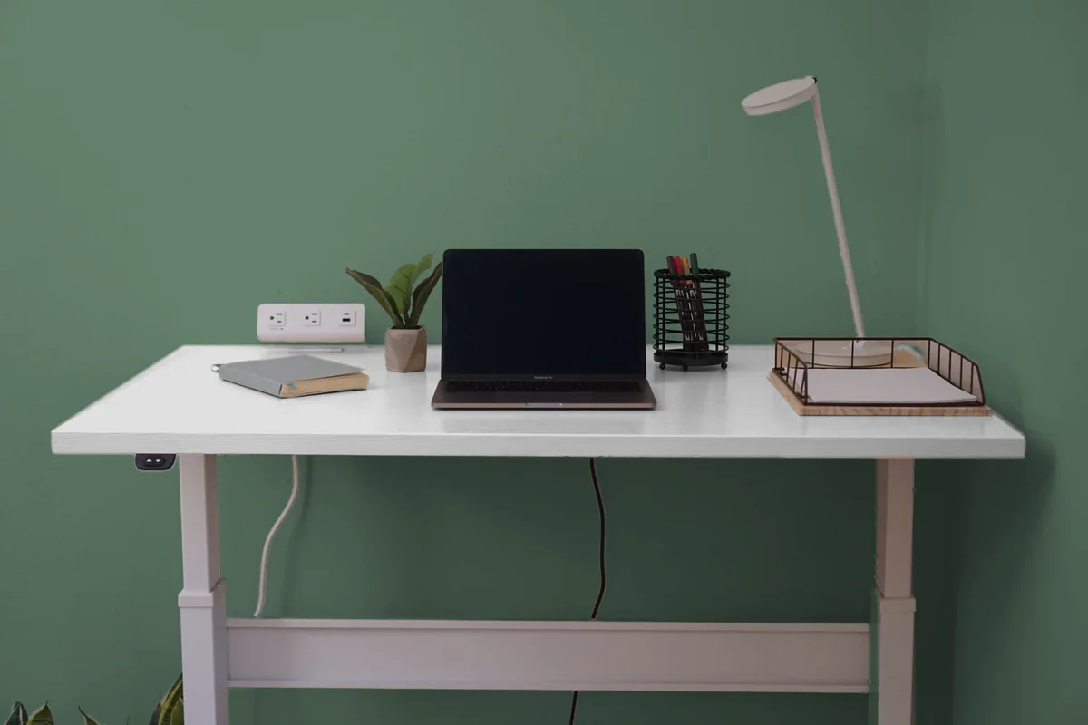
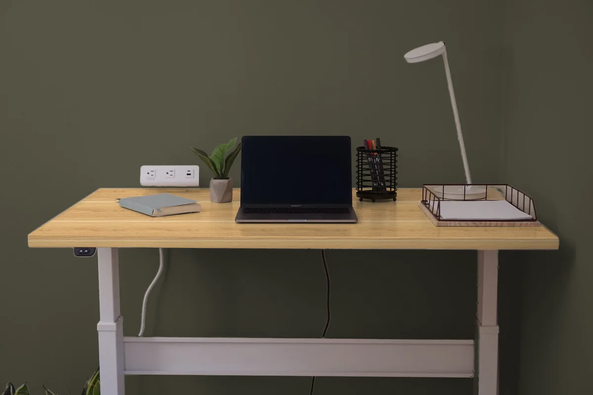
Behind a desk, Celery, Webster Green and Grounded are very different. Celery is light and lets a light wood top blend in, while the other two are deep enough to set off a white one.
The 2026 picks didn’t agree at all. Sherwin-Williams went with the warm neutral Universal Khaki, Benjamin Moore with the espresso brown Silhouette, and Behr with the smoky jade Hidden Gem.
As for gray, Sherwin-Williams wrote back in 2019 that after a decade of gray, the trend was shifting from cool to warm as beige came back. Of the six picks for 2026 and 2027, not one is a gray.
Questions
Should a home office be painted a dark color?
It can be, if the room gets good light. A deep color like Grounded or Tarpley Brown makes a white or light wood desk stand out, and a walnut desk fades right into it.
What color should you paint an office with no windows?
Something light, like a soft white or a pale gray such as White Heron or Gray Owl, so the walls bounce more light around. Under cool white bulbs, a color with a warm undertone, like Celery, keeps the room from looking cold.
Should your desk match the wall?
It can. A desk close to the wall’s lightness blends in, for a quiet look, and one far from it stands out, if you’d rather show it off.
Can you trust the colors on your screen?
Close, but not completely, since a screen isn’t a paint chip. Get a sample and look at it on the wall during the hours you work.
Is an accent wall behind a desk a good idea?
It’s a nice way to try a deep color without painting the whole room. Oceanside and Grounded both set off a white, maple or bamboo top, and Webster Green does it behind a white one.
How does the matcher decide a desk stands out?
It compares the wall’s color with the desktop’s middle tone, using the contrast ratio the web’s accessibility rules use to check that a button stands out from what’s around it. At 3 to 1 or more, the desk stands out, and under that, the two read as one soft tone. That line was written for screens, not furniture, so take it as a rule of thumb.
Sources
- Sherwin-Williams, Home Office Paint Colors: its advice for detail and creative work, dark and sunny offices, and its soothing and versatile colors, read October 27 and 28, 2026.
- Benjamin Moore, 14 Home Office Paint Colors and Ideas to Boost Productivity: its favorites and sheen advice, read October 27, 2026.
- Behr, Office Paint Colors and Inspiration: its popular office colors, the ten office palettes and their trim whites, and its office FAQ, read October 27, 2026.
- Sherwin-Williams color pages for Celery, Rock Candy, Alpaca, Country Tweed, Grizzle Gray and Oceanside: hex, LRV, descriptions and coordinating colors, read October 27 and 28, 2026.
- Benjamin Moore color pages for Webster Green, White Heron, Ballet White, Gray Owl, Cushing Green, Beneath the Clouds and Tarpley Brown: LRV, descriptions and color combinations, with the hex from each page’s color data, read October 27 and 28, 2026. Its LRV explainer is the tooltip on each color page.
- Behr color pages for Grounded, Painter’s White, Sculptor Clay, Letter Gray, Whitewater Bay and Half Sea Fog: hex, LRV and descriptions, read October 27 and 28, 2026.
- Sherwin-Williams, Choosing Color Based on Room Orientation: north, south, east and west light, lighting for a home office, and what LRV means, read October 28, 2026.
- Sherwin-Williams, How Light and Finish Affect Paint Color, February 23, 2023: bulbs and time of day, read October 28, 2026.
- Sherwin-Williams, How To Match Flooring and Wall Colors: undertones, warm walls with warm floors, light walls over dark floors and white baseboards, read October 28, 2026.
- Behr, Best Colors for Home Offices, August 16, 2021: lighter colors for an office with little daylight, read October 27, 2026.
- Sherwin-Williams, Grayed Out? The Return of Beige, November 19, 2019: the shift from cool to warm neutrals as beige came back, read October 28, 2026.
- The 2027 Colors of the Year: Sherwin-Williams, Celery, announced September 15, 2026, with its Color of the Year page and its blog post of September 17, 2026, which pairs Celery with Cocoon. Benjamin Moore, Webster Green, announced October 14, 2026, with its Color of the Year page. Behr, Grounded, announced August 26, 2026. All read October 27 and 28, 2026.
- The 2026 Colors of the Year: Sherwin-Williams, Universal Khaki, announced September 24, 2025. Benjamin Moore, Silhouette, announced October 16, 2025. Behr, Hidden Gem, announced July 30, 2025. All read October 28, 2026.
- W3C, Web Content Accessibility Guidelines 2.2: relative luminance, contrast ratio and the 3 to 1 line for non-text contrast in Success Criterion 1.4.11, read October 27, 2026. That line is adapted here for a desk against a wall, since WCAG doesn’t cover furniture.
- Every stands-out and blends-in verdict is Corner Nook’s own arithmetic, using the WCAG 2.2 contrast ratio between each brand’s wall hex and the middle tone of each desktop finish, worked out October 28, 2026.
- Desktop finishes and frame colors: UPLIFT Desk, V3 Standing Desk and its swatch images. FlexiSpot, E7 and E7 Pro and their swatch images. The RightAngle finish chart is on NextGen Furniture’s Bonita ET page. All read October 27, 2026. The colors are Corner Nook’s sampling of each brand’s photo, not a figure the brand publishes.
- The room in the matcher is my photo of our den corner, taken November 16, 2020. The wall and the desktop take the paint or finish you pick over the photo’s own light and shadow, and the white frame and everything else stay as photographed. Every finish, UPLIFT Desk’s and FlexiSpot’s too, is shown on the shape of my desk’s top.